Project information
- Industry: UK Government, Technology
- Client & Year: Accenture, 2018
- Platforms: Web based centralised system
- Roles Performed: UX/UI Designer, Accessibility Analyst & User Researcher
Accenture
Designing a centralised web portal to source legacy data from multiple UK Government departments
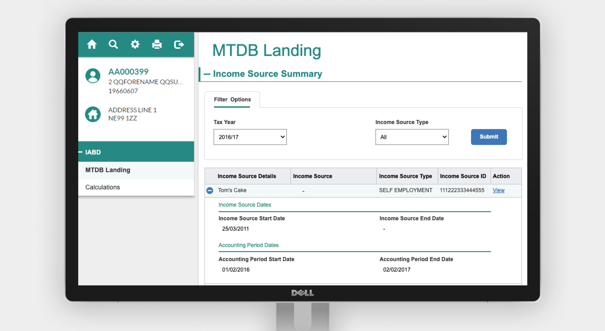
In 2018 I performed multiple UX roles across multiple scrum teams working on the UK Gov centralisation project. The goal of this project was to to co-ordinate and implement a product design project across four different departments in an effort to modernise and centralise a legacy console based system used by the live service support teams. The system needed to be made accessible to WCAG 2.0 AA standard, and it needed to closely follow GDS design patterns and guidelines. The system was to create a centralised source of information which could be used to retrieve the legacy system information in an easy to understand format, and provide accessibility support which was not present in the current system.
What was delivered
The assets were delivered for this project:
a styleguide with accessibility guidance
for the development and engieering teams to follow with linked sources of design and UI best practicea and WCAG guidancean interactive prorotype in Axure
showcasing how complex data from different government departments would be shown and highlighting how access would be determined by user rolesan internal accessibility audit
reviewing the built system against WCAG criteria and testing out the system using a screenreader and keyboard only interactions
Results
The project successfully passed a WCAG audit performed by Fujitsu and a private alpha release was launched to show senior stakeholders how the project could be developed further.
Research provided insights to highlight that using the centralised system would introduce performance improvements of up to 52% compared to time taken to perform the same tasks on the existing console based system.
Research and Requirements
Initial focus groups with call center staff to understand current pain points and frustrations with the current system were performed. Data was also captured to map out at a high level the kinds of tasks live service agents typically perform on a daily basis. A community of practice was established across all four departments to ensure design and accessibility consistency was communicated with weekly meetings. I also worked with the Technical Architecture team to understand any technical limtations with the technology solution, and to promote the art of the possible.
Design
I worked across the four government departments within each of their agile product development teams, creating alignment across their requirements and leading the UX vision for this product. I used sketches to facilitate functionality discussions amongst the engineering team and BAs during the agile scrum meetings.I mapped out the 'as is' and 'to be' system flows to understand the typical paths we needed to design for in the system. To meet the requirement of a centralised source of information adhering to GDS guidelines and accessibility best practices I created style guides with accesibility guidance, component states and colour palette requirements to ensure the look and feel was consistent across departments. I also introduced an Axure component library based upon GDS. An interactive Axure prototype was created as a deliverable within the development team to illustrate interaction behaviour and expected navigation flows.


Accessibility
I ensured that consistent simplistic langauge and labels were used across department screens and any acronymns were well defined within the constraints of the system. I worked with the Technical Architecture and Engineering teams to promote accessibility best practices at a code level and how to recover from audit failures to ensure AA WCAG 2.0 standard was met.