Project information
- Industry: Fintech, UK Government
- Client & Year: Capita, 2020-2021
- Platforms: GDS, Responsive Website, Salesforce
- Roles Performed: Lead UX/UI Designer, UX Strategist & User Researcher
Capita
Using a Salesforce powered application management system to deliver the DIT Internationalisation Fund
The European Regional Development Fund (ERDF) Internationalisation Fund, run by the Department for International Trade (DIT), provided co-investment grants to Small and Medium Sized Enterprises (SMEs) to help them expand their capability to internationalise. DIT required a simple and easy-to-use application and claims process. We designed a streamlined, consistent method for applicants to apply for funds and introduced automation with our centralised digital grants management platform Grantis. In collaboration with SMEs and policymakers, we created a fully digitised service from application to payment, reducing administration costs and simplifying the application process for SMEs. I led and delivered the user experience design in alignment with UK Government standards (GDS) throughout the project lifecycle.
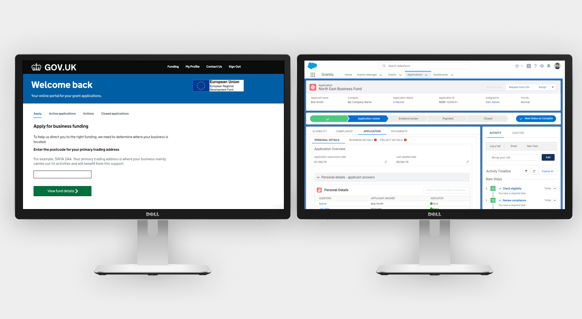
Grantis grant management platform powered by Salesforce
I was heavily involved in helping craft Capita's grant managment product Grantis from it's initial PoC all the way through to multiple bid responses and two client implementations working with central government departments. Grantis is a Salesforce platform product which has a GDS themed front end following best practice design patterns and adhering to accessibility standards, and a Saleforce custom back end interface which can be used for grant administration and reporting and dashboards. The combination of both provides a positive application experience with the ability of filtering applicants through an initial eligibility checker service and status updates within a customer portal after submission, and from a processing perspecive allows a customisable review back office process where automation can be used to reduce the amount of manual processing required to make a decision on a grant application. I became initially involved in this project as one of the founding members of the Digital Product team in the specialism of UX and later grew the team to ensure we had experts in the fields of User Research, Content Design and UX Design to ensure our client implementations followed service design standards and user centric design principles.
Results
DIT was the first live implementation of Grantis being applied to a large scale UK Government service, and after going live it enabled over 200 SMEs each montht oa pply for up to £38 million of co-investment grants to enable internationalization for their businesses. It also streamlined admin costs as the application process through the Salesforce implementation intrdocued levels of automation which would increase the processing times of applications by 48%.
Concept poster for Grantis
The initial concept for Grantis was to enable funding schemes within government to be faster, cheaper and easier, and to introduce automation into parts of the review process.

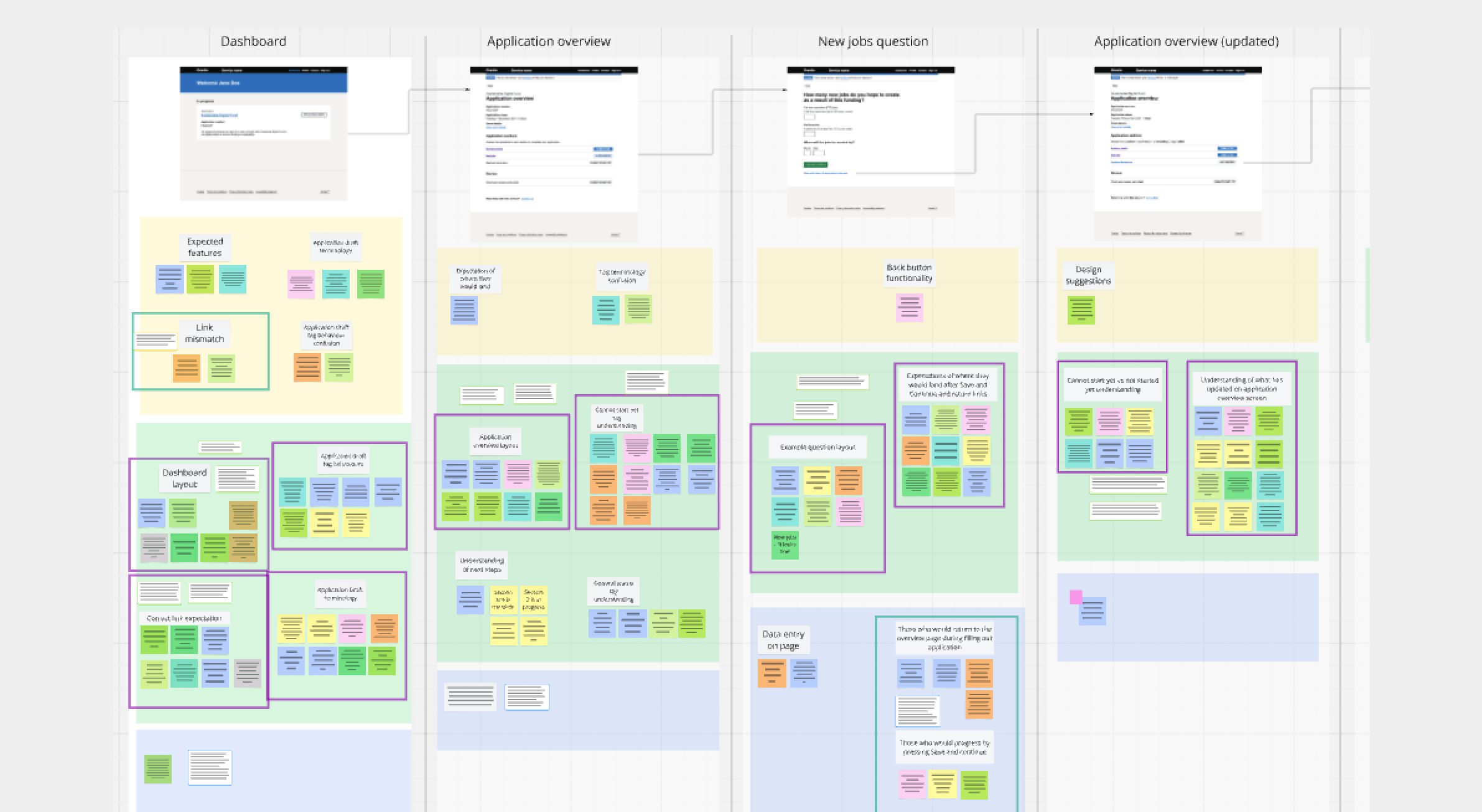
Mapping out the journey
Part of my initial work on Grantis was to map out the MVP product as it evolved from the initial PoC. UX recommendations based on the review of the initial PoC fed into the requirements to improve the product to design the version which would become the MVP. This diagram shows how screens were mapped alongside process flows provided by the Business Analyst team, which the UX team turned into tasks a user would need to perform, and user needs and UX improvements were also documented.

Iterative design
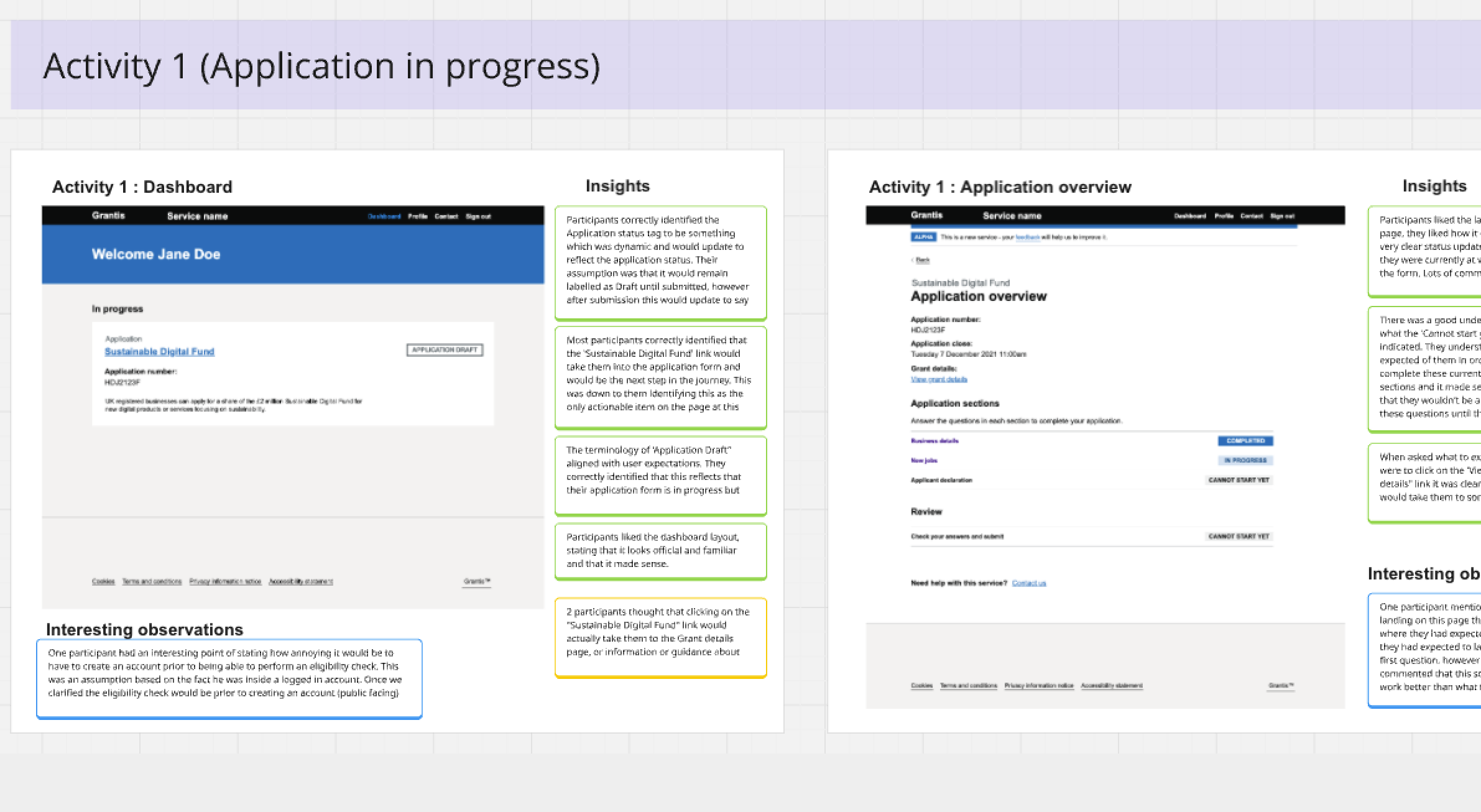
Multiple research rounds were performed on the built version of the product and on interactive Axure prototypes of proposed design features to add to the product to gauge customer engagement and usability. We mapped out high level research plans prior to each session, worked on understanding what needed to be validated and then we worked on writing discussion guides. The findings after data analysis were mapped onto Miro boards against the screen flows and insights were identified and played back to the team.

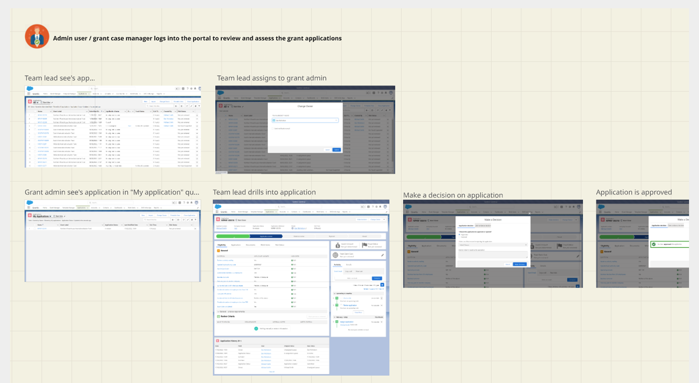
Back end processing
Axure prototype testing was performed to understand exactly what functionality was required from admins to process grants and what information was a priorty to make these decisions. A customised work area was created with a task list guiding an admin through the process of reviewing a grant application.
APPLICATION PERSONAL DETAILS SECTION
The grant admin can use this screen below to review the applicant's personal details.

APPLICATION DOCUMENTS SECTION
The grant admin can use this screen below to review the provided documents and compare them against any review crtieria.

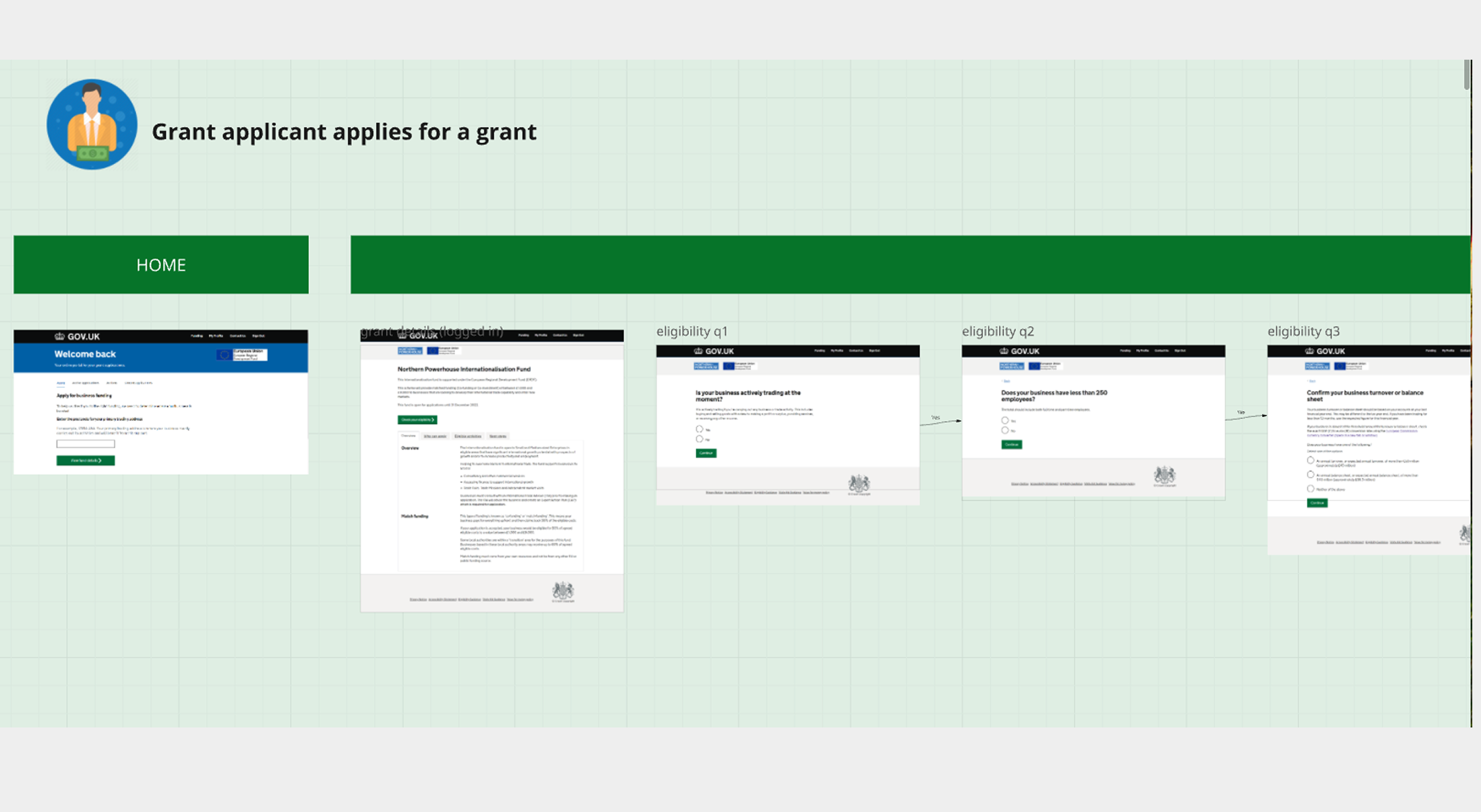
Application task flow mapping for the application front end portal
Task flows to map out the journeys for each step in the application journey were created so that a high level view of the intended functionality could be used in discussions with development teams to validate whether certain features were technically feasible before crafting detailed wireframes based on content from our content team and actual application questions.

Designing a UK Government service for DIT
We followed and implemented Agile methodologies within the product development team to follow UK Government standards and to work in Agile delivery phases from Discovery, Alpha, Beta and then Live.
USABILITY TESTING RESULTS
The below shows how I conducted the analysis of data by importing the screen flows from the design prototype and then performing an affinity mapping exercise with the insights and pain points.
PRESENTING RESEARCH FINDINGS BACK TO THE PROJECT TEAM
I created a presentation deck showing the screens which were tested and then a summary of quotes and key insights from the round of research and presented this back to the team with recommendations.
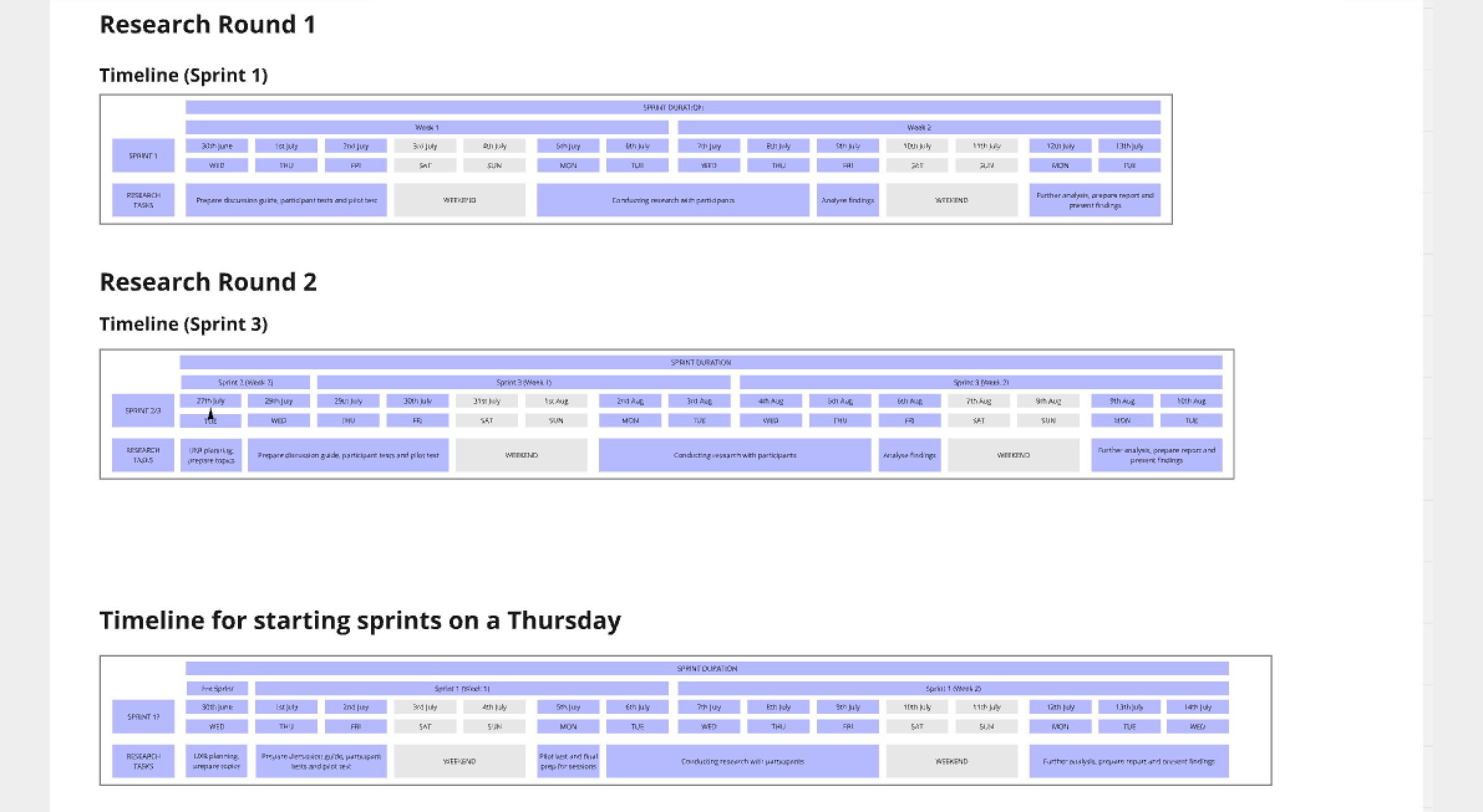
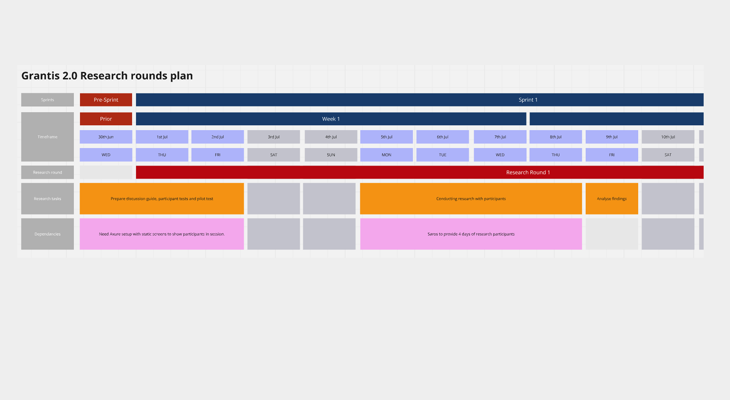
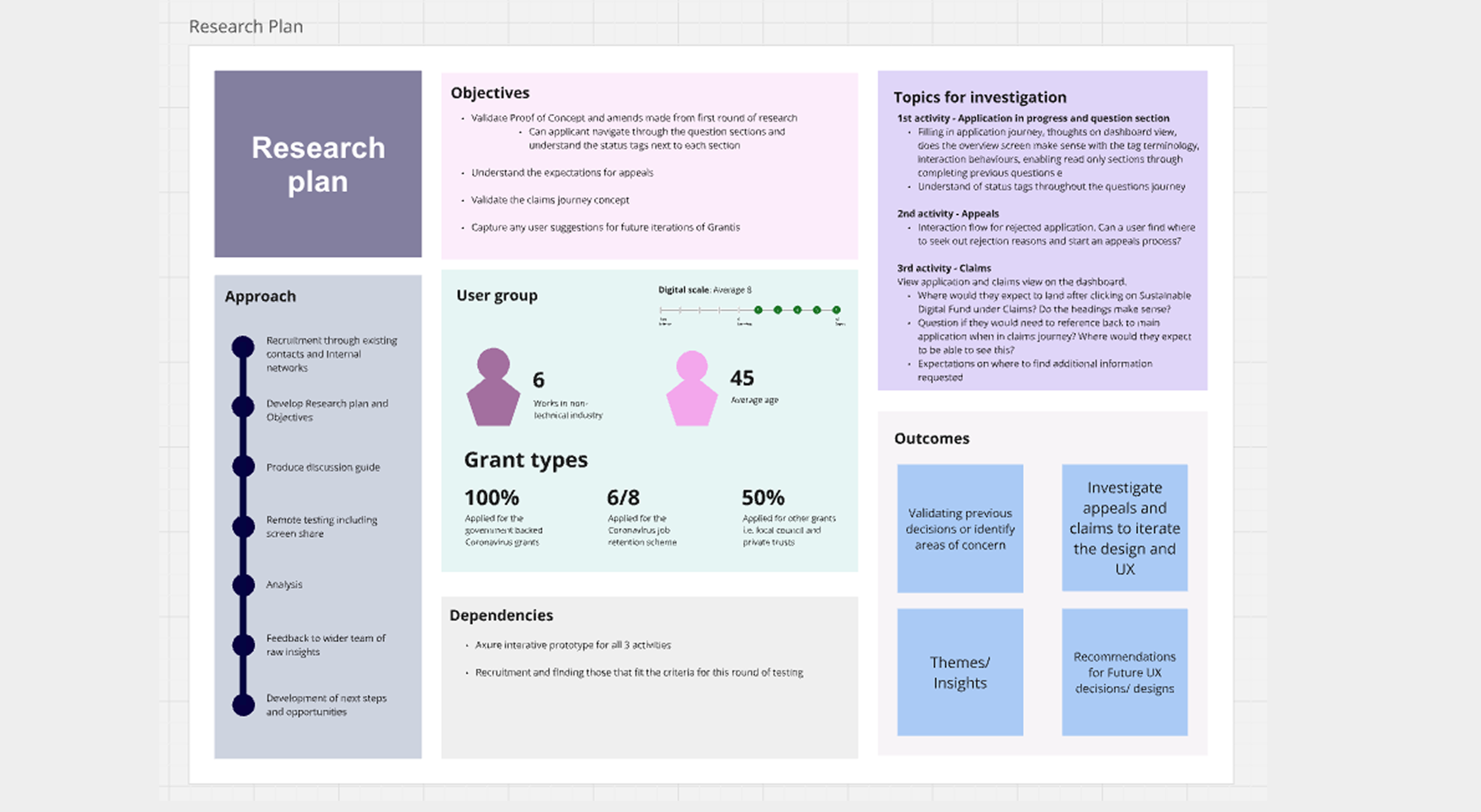
PLANNING RESEARCH
The below are a few assets that show how research was planned and prepared before the sessions were held.
JOURNEY MAPPING
We created personas for the DIT service, the two main ones were the grant applicant, and the application admin. We then mapped out the screens, both during the initial design phases, and then again later using the screengrabs from the built environments.
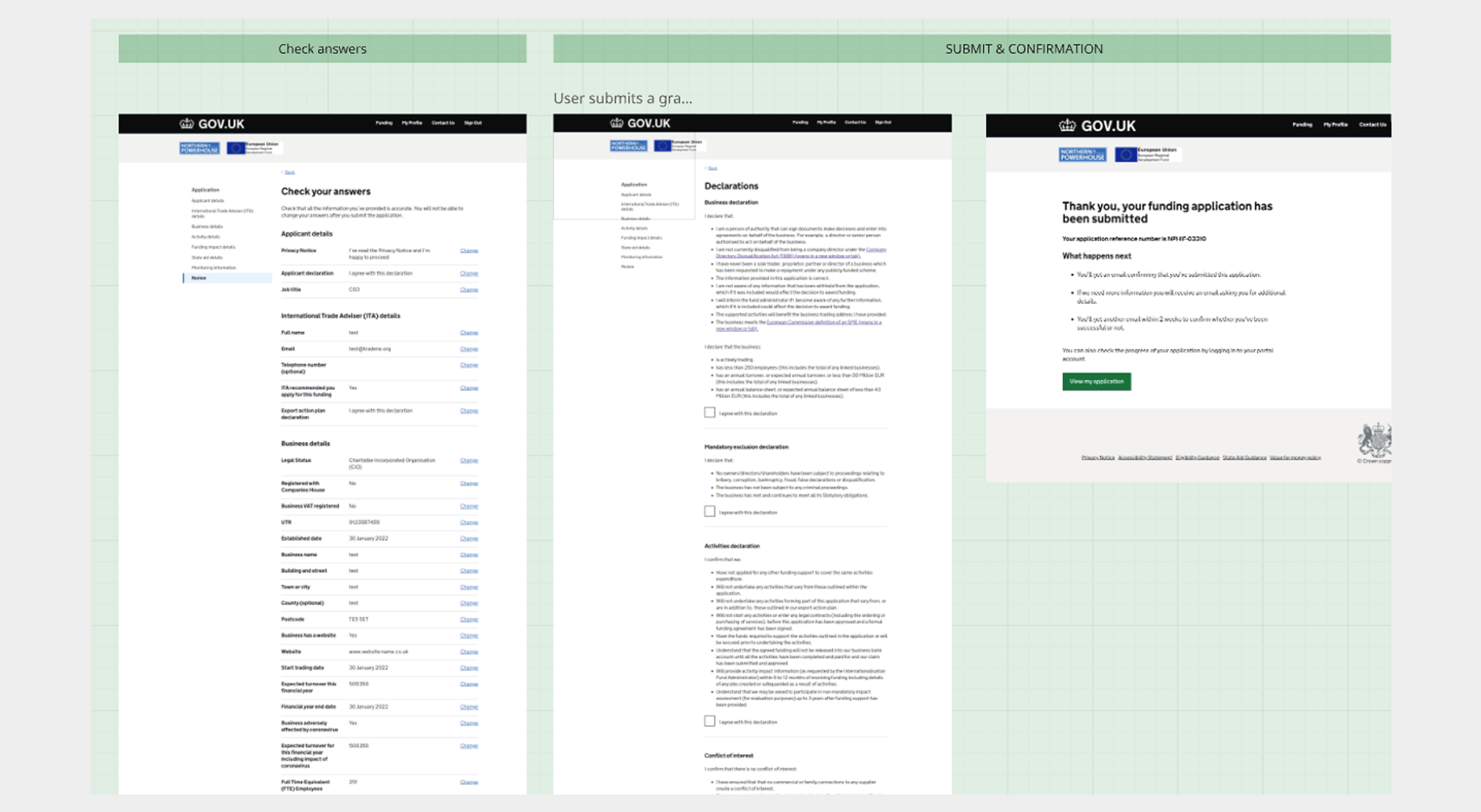
FINAL SCREEN DESIGNS
Below are a few examples of the screens for this project. In total there were around 250+ screens designed and completed for this service.