Project information
- Industry: Travel & Transportation, Cargo
- Client & Year: Unisys, 2024
- Platforms: Responsive Web
- Roles Performed: Supporting Principal UX/UI Designer
Unisys
Modernising a legacy freight forwarding platform for airlines
Cargo Portal Services (CPS) has served over 3,000+ global freight forwarders for over 20 years, but the platform was built on a legacy JSF framework that was not mobile-friendly and relied on outdated workflows and a complex UI. It was clear that the current system had been built with a technical focus in mind, and work needed to be performed with the project team to promote the value of user centred design, promoting a user experience which was based on how the users interact with the system, rather than just being a tool used to present information back to the user.
In 2024 I performed a supporting Principal UX/UI Designer roles to help another Principal UX/UI Designer who was leading the UX vision for this project. The goal of this project was to deliver a modernised UI for a selected scope of screens and to make these screens web responsive and to improve their load performance. Many of the screens for this portal were very complex and data heavy, so the main goal of the project was to simply and standardise where possible.
What was delivered
I contributed the following for this project:
wireframe and design concepts for an updated booking journey
that enabled freight forwarders to book cargo onto planes from a variety of airlines and to be able to compare rates.wireframe and design concepts for an updated template journey
that enabled freight forwarders to save commonly shipped cargo products in a template format that could be reused or scheduled for an ongoing delivery.accessibility and analytics support
that provided guidance and advice for both suppliers of analytics and accessibility options, but also providing in house training and content on these topics.
Results
The project successfully released updated versions of these journeys and promoted them via a regular newsletter that is sent out to existing users of the system.
After deploying an analytics solution the project team was able to identify further areas which had performance issues, and had a clear roadmap for prioritisation for further iterations of work.
5 new airline clients onboarded onto the system after release, the new journeys provided 60% performance improvement compared to the legacy versions, there was a 35% increase in new user registrations and there was a 57% increase in user satisfaction.
UX Process
A Design Thinking methodology was followed for this project, prioritising understanding the context and usage of the product and ensuring the design appraoch was balanced with the technical requirements for the project and that everything was in line with business needs.
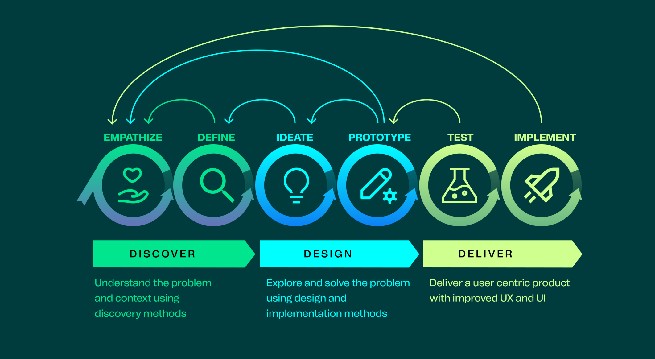
Discover
Understanding the problem and context using discovery methods
Competitor Analysis
We performeded research and analysis on existing cargo portals available to compare product features and design patterns. This competitor analysis allowed us to showcase what was already available as market offerings and to position ourselves accordingly. Expected features and common patterns were discussed amongst the wider project team and this also influenced our roadmap priority of features.
Ideation Workshops
We facilitated ideation workshops where we would discuss the current screen designs and usage with users in multi-disciplinary calls to understand both business and technical requirements.
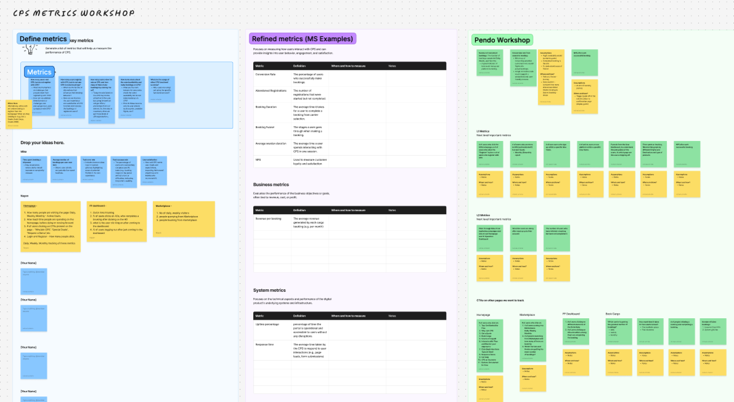
KPIs and Metrics
We held a series of workshops to understand what metrics and KPIs we would want to start tracking, and how we would measure these in our analytics tool of choice.
Design
Exploring and solving the problem using design and implementation methods
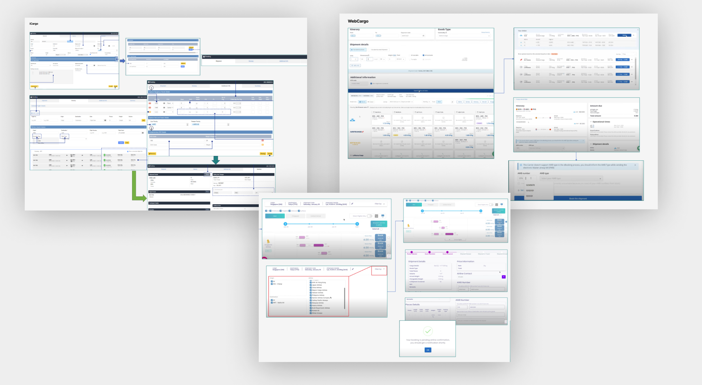
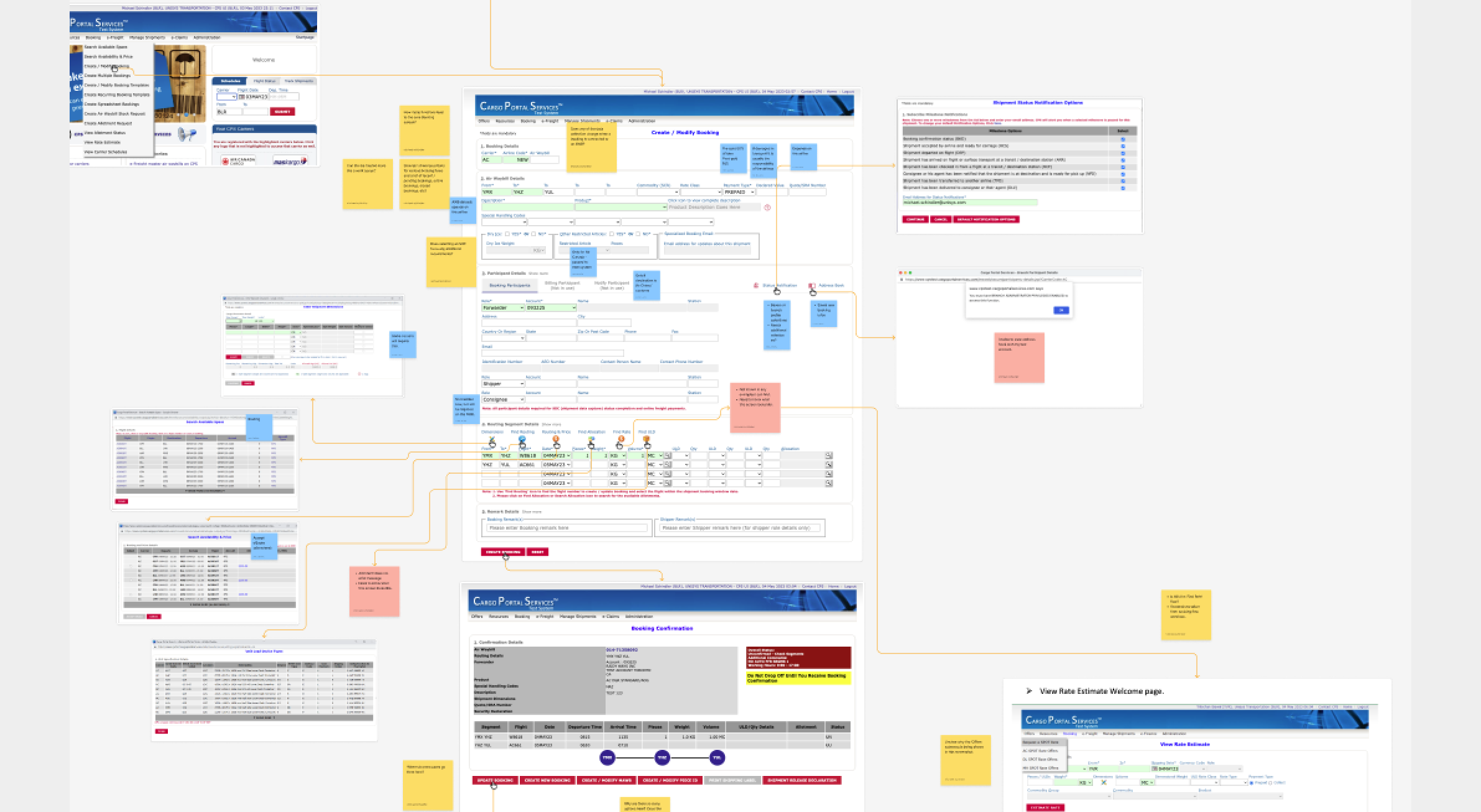
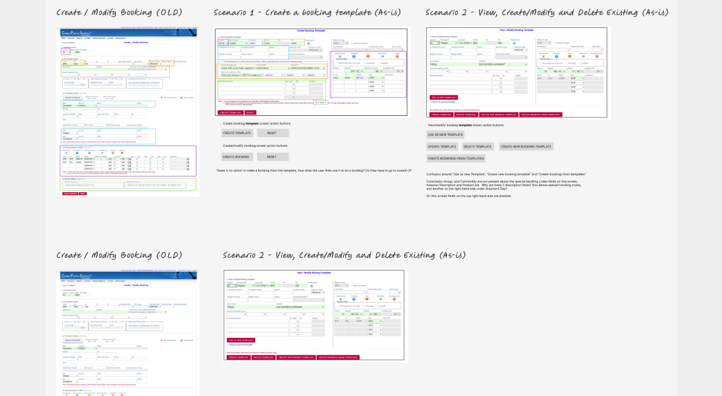
Mapping out the existing customer journey and screens
Mapping out the existing customer journey and screens was essential in fully understanding how the current product worked, and to identify areas where there was duplication of functionality and opporunity to streamline the experience.
Wireframes for the iOS app redesign and how they developed into the high fidelity UI screens
I designed initial wireframes to showcase the new navigation and layouts for the key screens and tested these flows with a small participant group to check these aligned with the card sorting exercise. These were then worked on further with input from the wider project team to implement the high difelity UI designs.
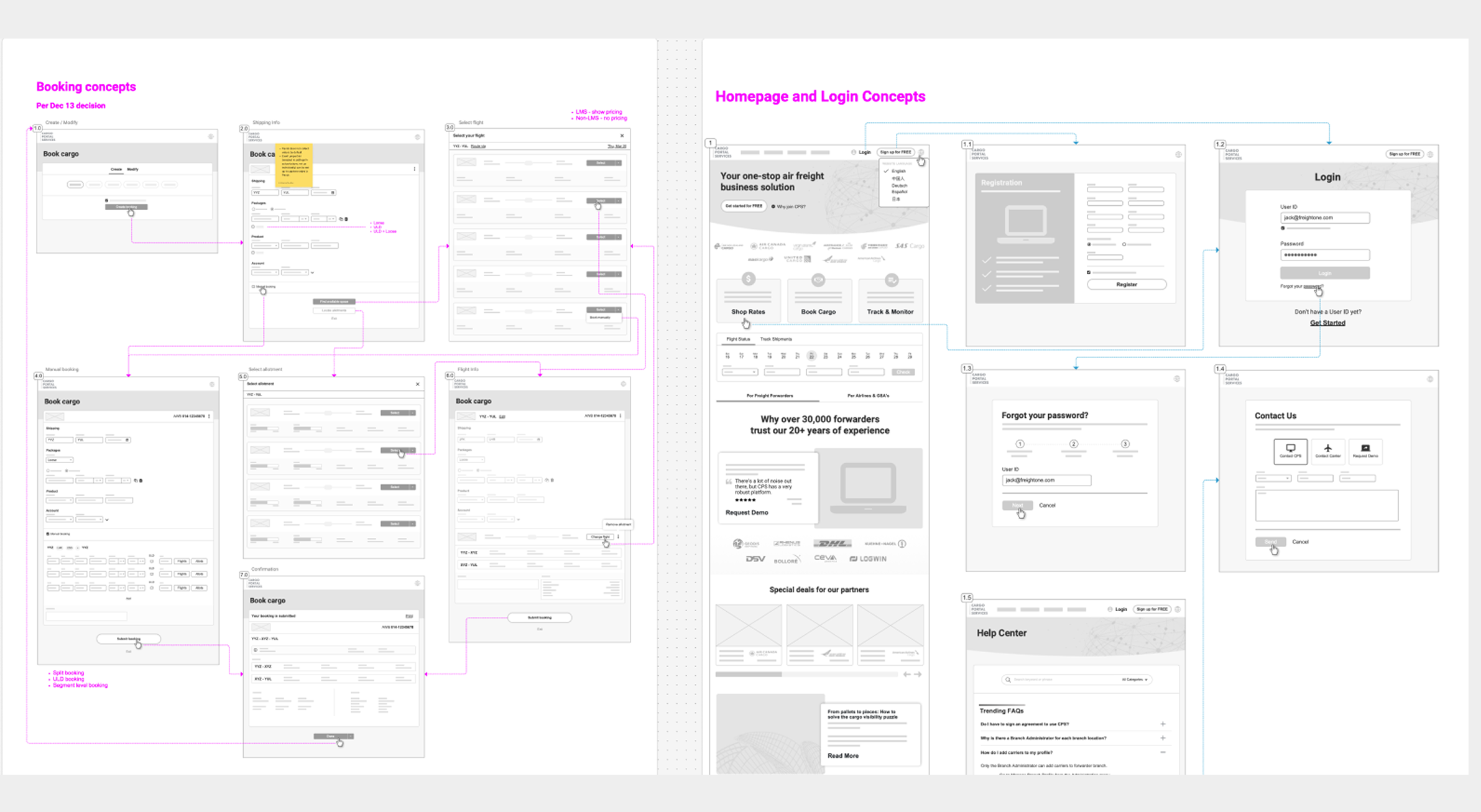
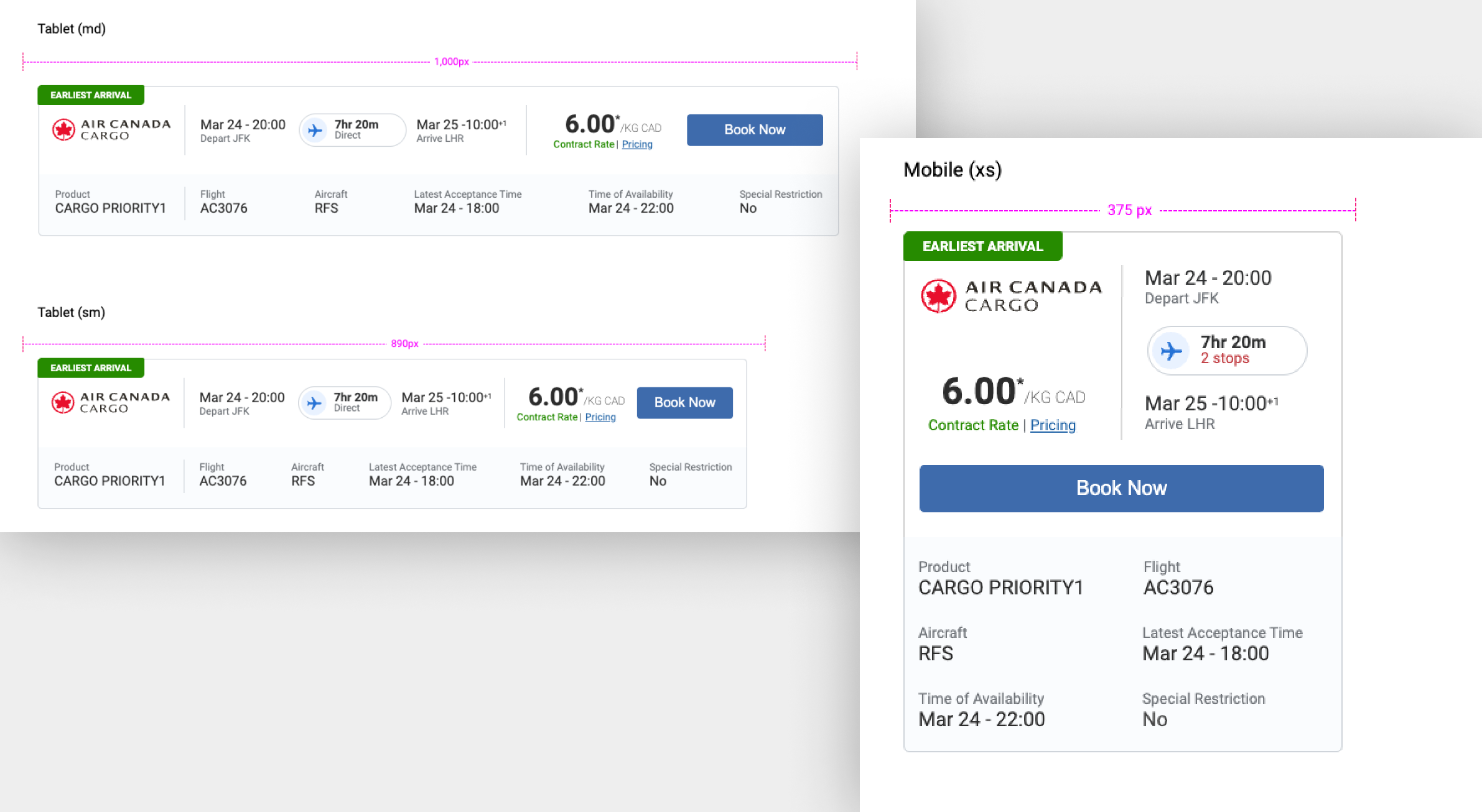
Exploring responsive design
Ideation workshops showcasing proposed design options were given to the wider project team to discuss the technical feasibility of the different ways that the admin portal could be implemented. Information architecture was updated based on technical requirements and the requirements for the language templates was also discussed.
Deliver
Delivering a user centric product with improved UX and UI
UI Improvements
The following usability updates were introduced as part of the scope of this project:
Simplified interface
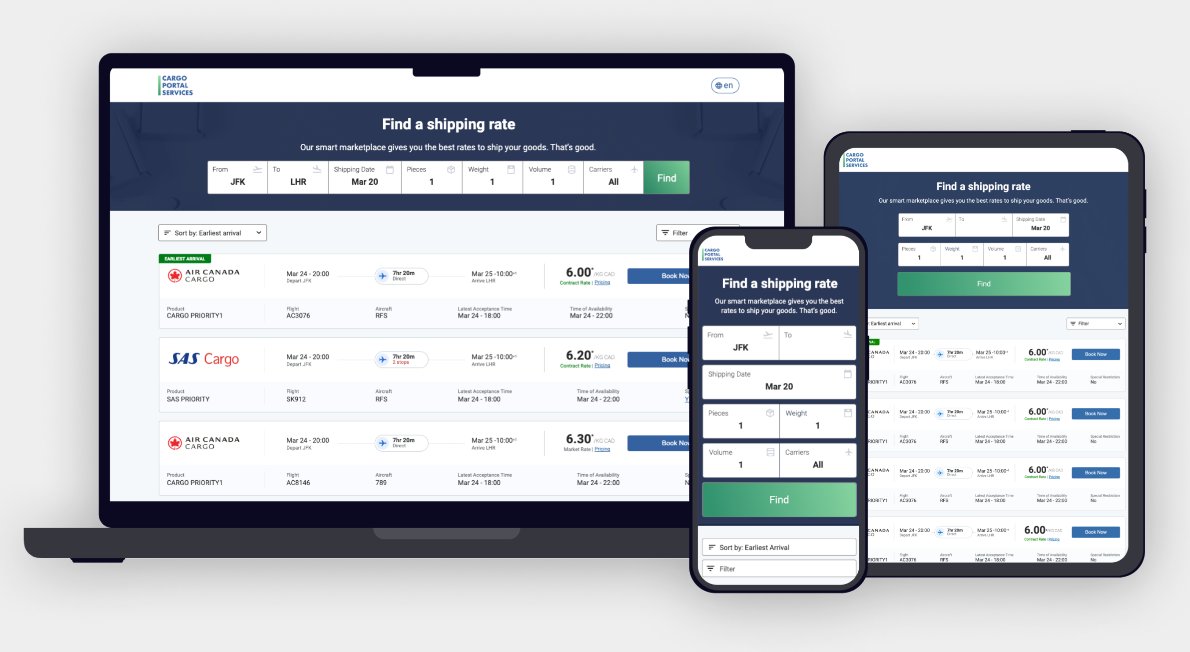
The number of fields present on the screen was reduced to improve readibility and to reduce cognitive load to the user.Responsive design
Updating the tech stack and introducing React enabled the interface to adapt to different viewports and to allow a more seamless experience across different devices.Fewer clicks for easy navigation
Options now appear after a single click, reducing the user requirements to search through multiple menu options to find actions to perform, speeding up task completion.Branded elements
Aline carrier logos were added to the booking results page to allow the user to quickly scan and identify known branding quicker.Improved filtering options
Customised filtering was introduced to allow the data to be narrowed down to a specific criteria.Pagination for results
Introducing page pagination allowed the user to jump between pages of results and to customise how many results per page were shown which increased performance and load times.
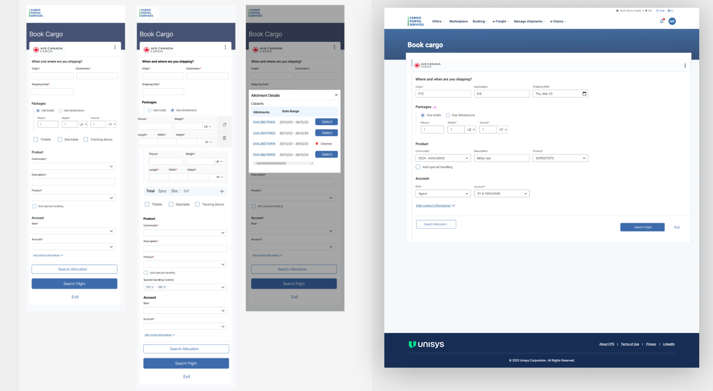
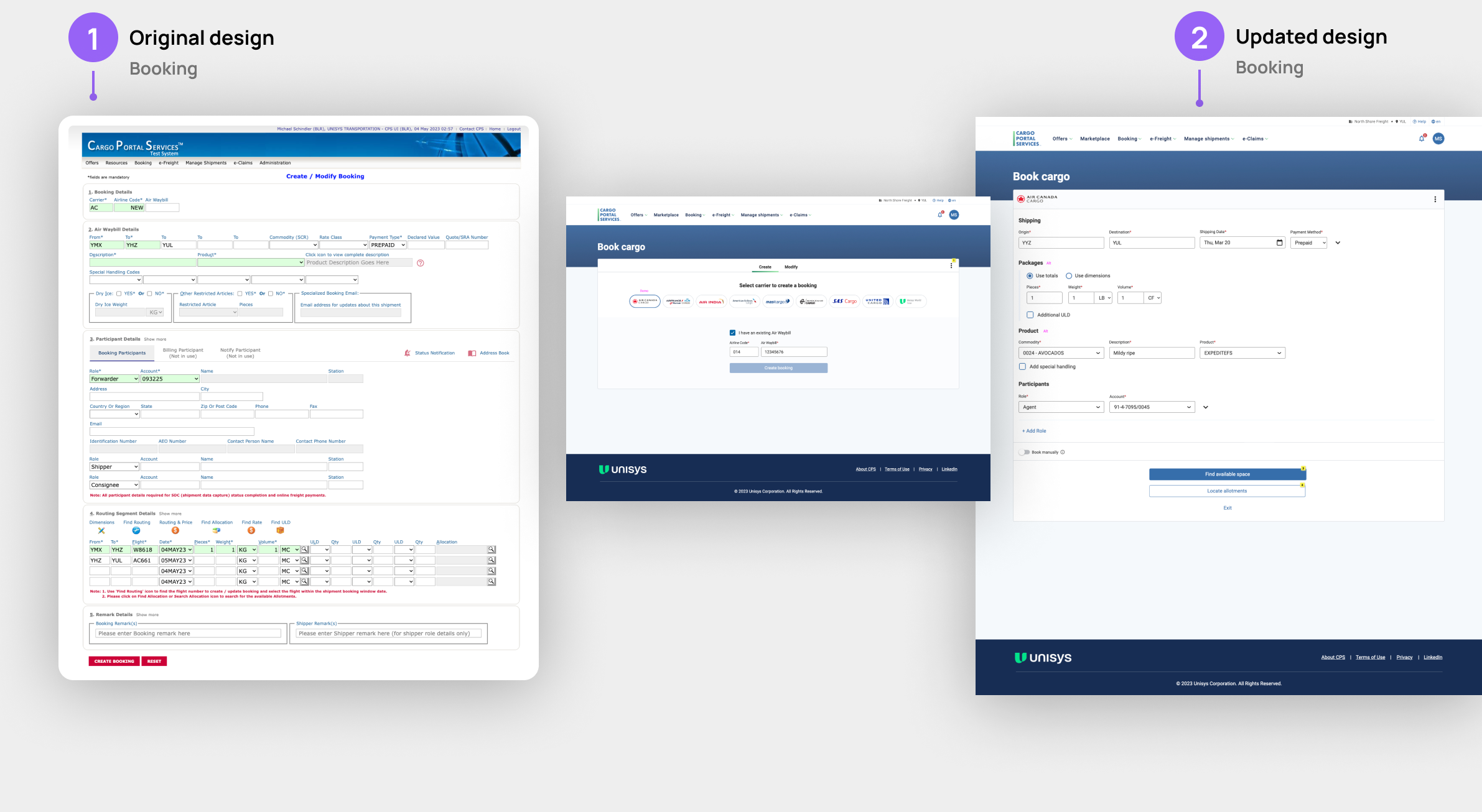
Comparing before and after
Here is a before and after comparison of one of the screen designs. It took multiple rounds of iterations to get to a streamlined and simplified layout with more complex fields conditional on the user input.
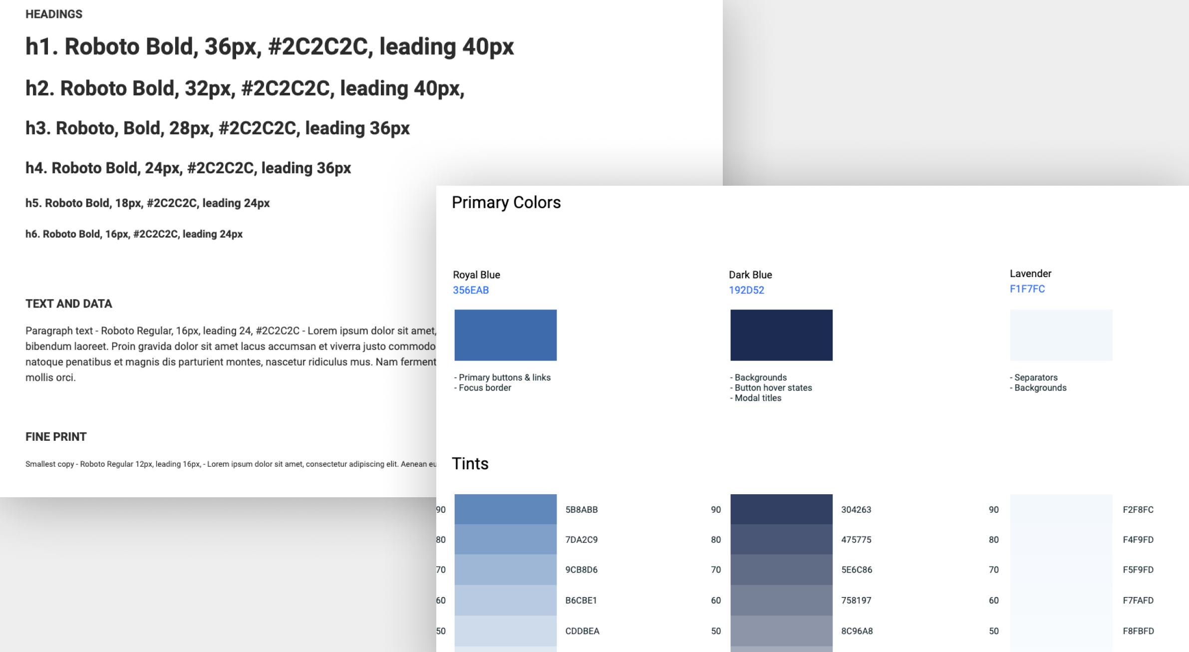
Style guide and example component usage
Some examples of the style guide that was implemented within Axure to document the required typography, colours and component usage across different viewports.
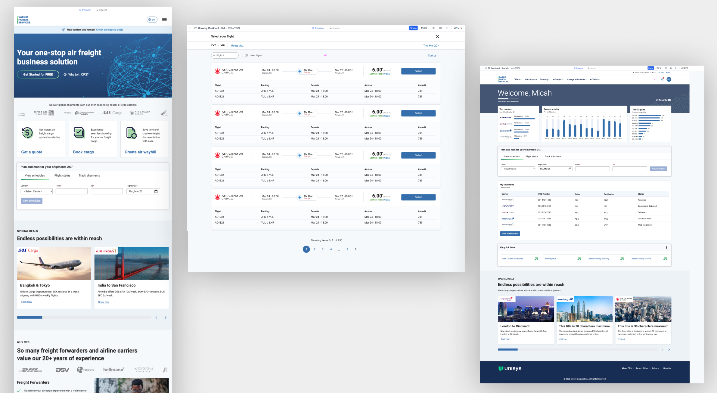
Final screen designs
Below shows a few of the final screen designs for the updated CPS journeys which were in scope.
Project challenges
In this project it was difficult to hold regular meetings as three timezones were involved, so a lot of the work had to be done asynchronously, however the use of whiteboarding tools such as FigJam, and having the ability to send an Axure prototype out with example interactions assisted greatly with this.
A large amount of screens were overly complex and had large amounts of data, so attempting to simplify resulted in having to break out screens across multiple views, or experimenting with having conditional content reveal itself when appropriate.
It was a requirement to have the new design launched in the current navigation structure, which meant a navigation and architecture review was out of scope for this project.