Project information
- Industry: Fintech
- Client & Year: Unisys, 2023 - 2024
- Platforms: Responsive Web
- Roles Performed: Principal UX/UI Designer & User Researcher
Unisys
Modernising the UI of a legacy enterprise banking product
Unisys Financial Services System (UFSS) is a legacy financial system used in a number of UK banks and building societies to perform mortgage, savings and other financial transactions at scale via Software as a Service and on-premise implementations. It has been servicing UK mortgages for over 25 years and a UI modernisation proof of concept was required to showcase where improvements could be made.
What was delivered
I delivered the following this project:
Initial legacy system UX review
with proposed design concepts and recommended changes.Updated system branding and standardised components
with improved navigation and simplified UI elements.Showcased how branding and theming can be applied
and also explored new feature concepts for AI driven chatbot and homepage content.Style guides
and Figma documentation showcasing how colours and components should be applied consistently.Presentations to clients
promoting the value of data driven design and how improving usability will increase efficiency.
Results
The developed proof of concept demo was positively received in a series of user forum calls with clients from UK banks and building societies and 6 clients were happy to move forward with developing a rollout implementation plan and to scope future screens for further work.
Further investment funding was secured through this project to explore the application of virtual assistant AI technology further after seeing how it could potentially be used in the demo.
Discover
Understanding the current system
Journey Mapping Existing Screens
I worked with the technical team to gain access to the existing legacy product and took screengrabs to map out the existing flows and to comment on any areas which needed clarification.
Initial UX review for existing work performed
A UX Review was performed for a selection of the legacy screens, as well as reviewing a current PoC that had been developed by the technical team without design input.
Feedback Format
A presentation was created in Figma, and this was exported as a PDF document to be presented on a design feedback call with a number of the internal stakeholders. The document gave visual examples of the legacy system, the current developed PoC and highlighted areas for improvement based on design best practices.
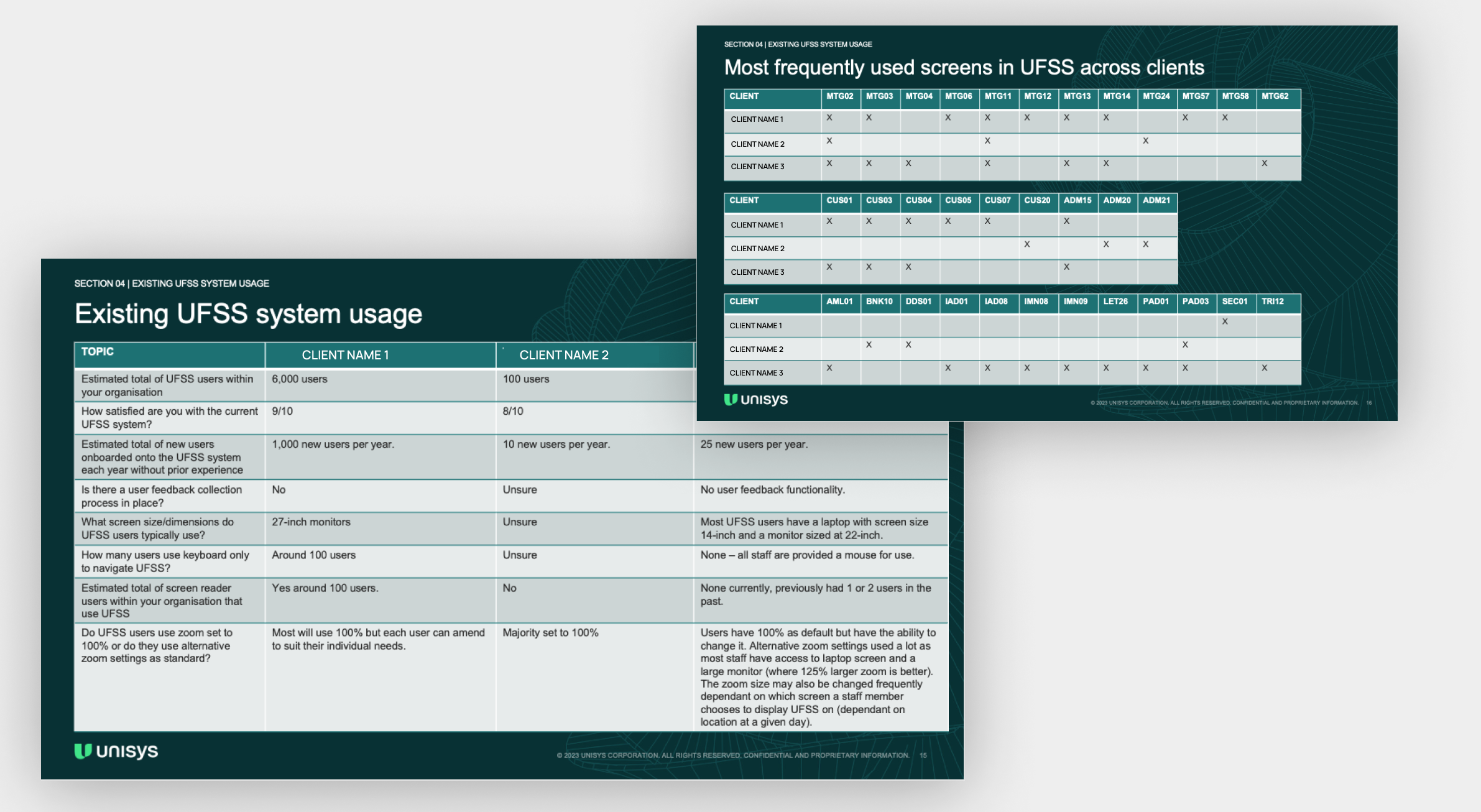
Banking Client Feedback Survey
A Microsoft Forms feedback survey was created to understand the current system usage and to gather information about user preferences. This also helped determine which screens would be the initial focus for this PoC.
Design
Proposing recommendations on how to update the UI
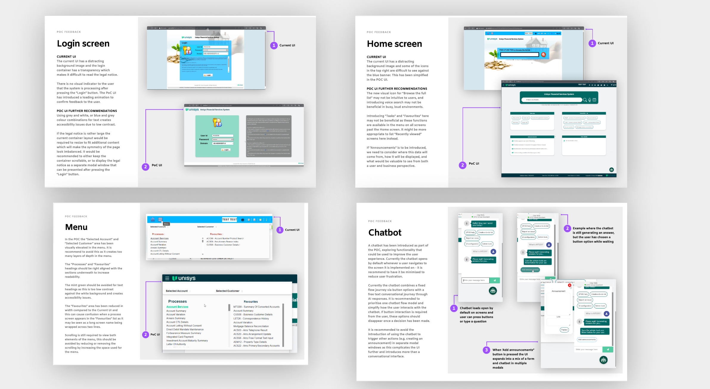
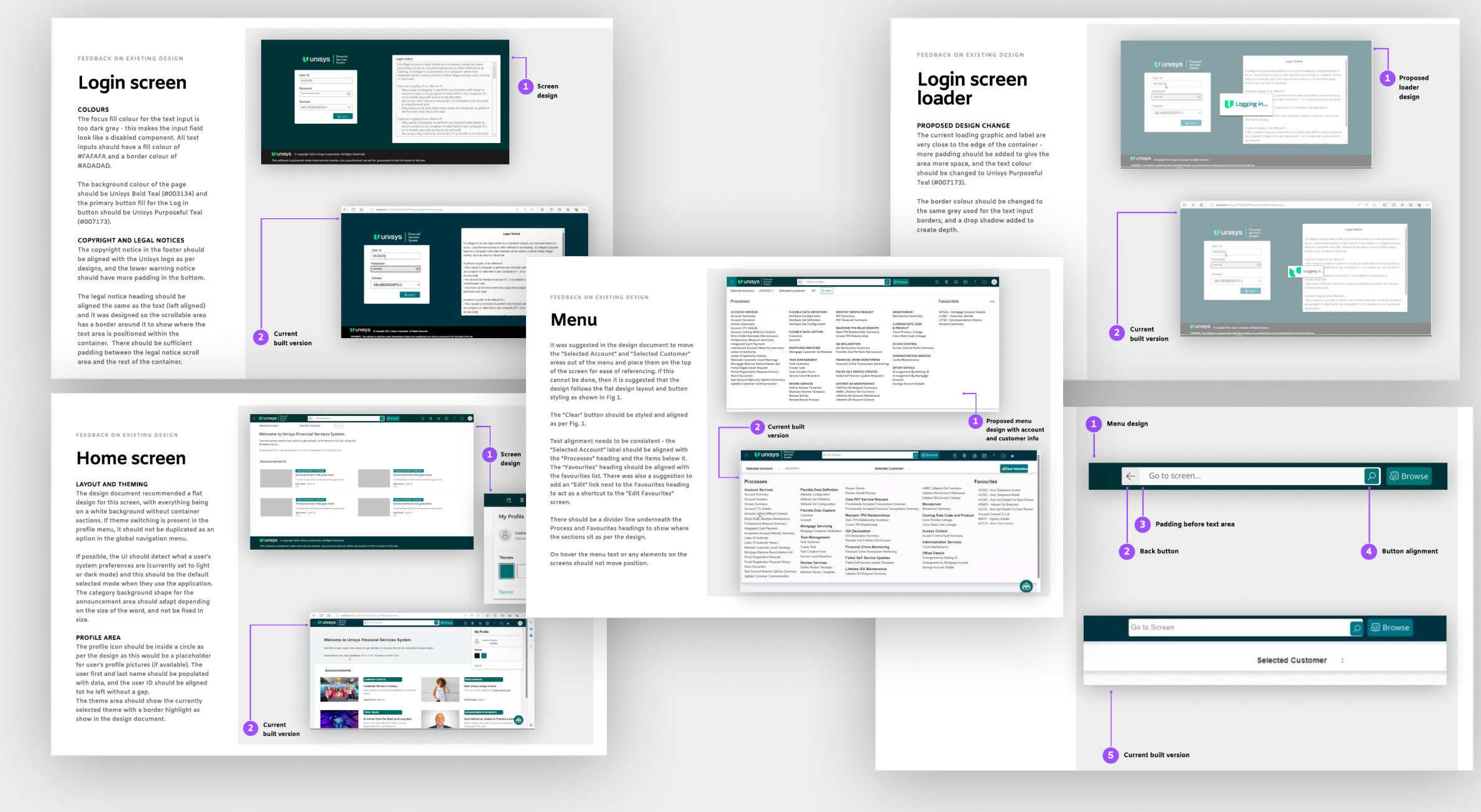
Login Screen
The developer PoC had introduced a grey background legal notice with white text which was difficult to read, and had attempted to use colours closer to the Unisys branding. I created a design more aligned with the Unisys branding and increased the legibility of the legal notice.
Home Screen
A new feature concept was introduced around using the Home screen as a landing page or portal for information which could be fed into it via client intranets or associated feeds.
UI Simplification
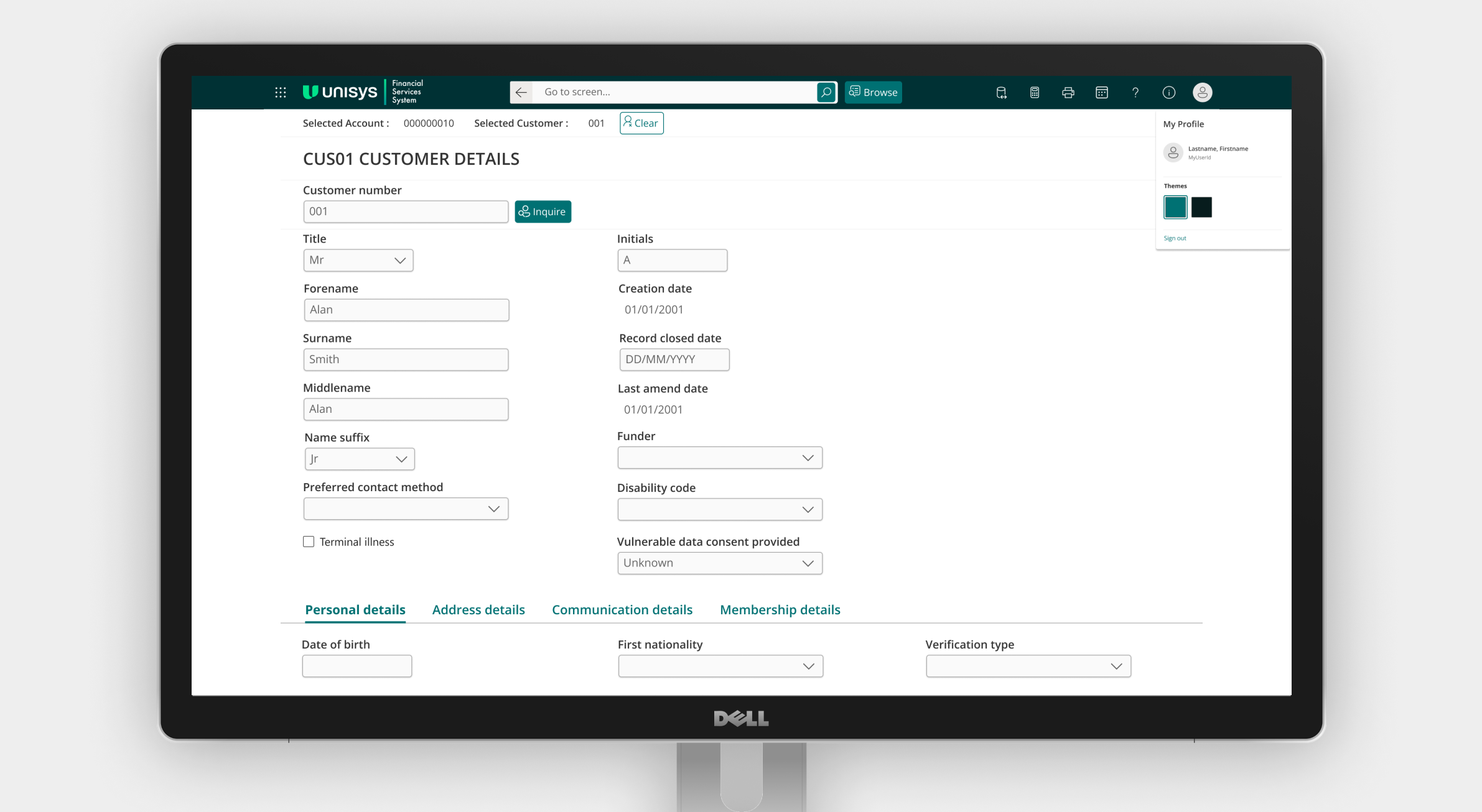
A design concept was created to showcase how simplifying the navigation could be achieved by bringing the navigational elements from the in page positioning into the global header, and to update the look and feel following standardisation best practices.
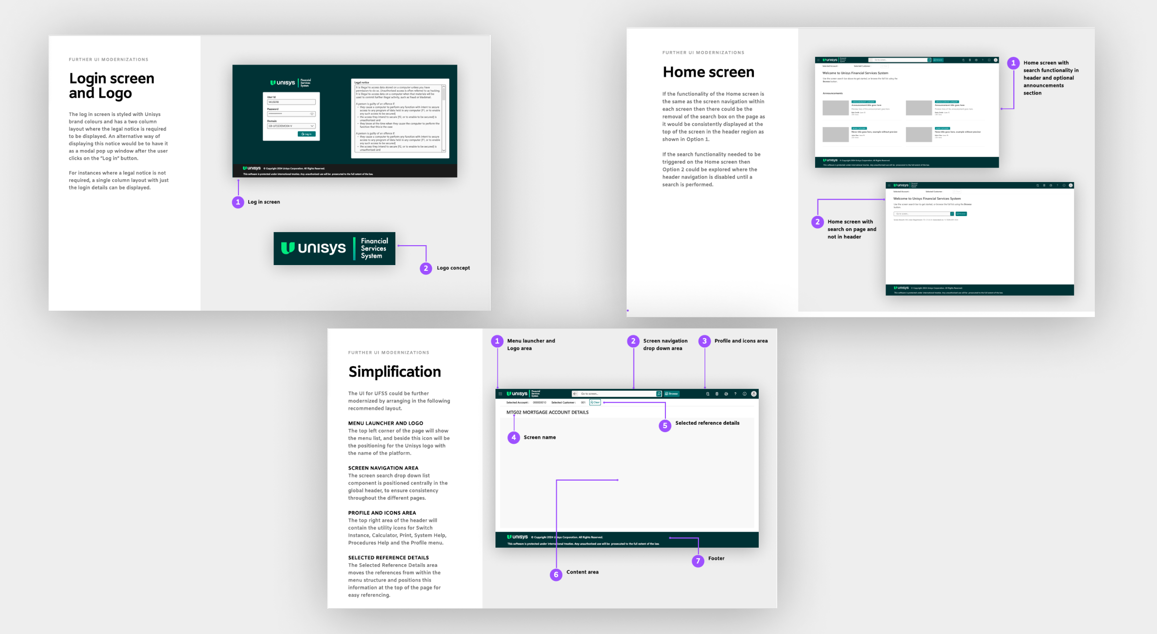
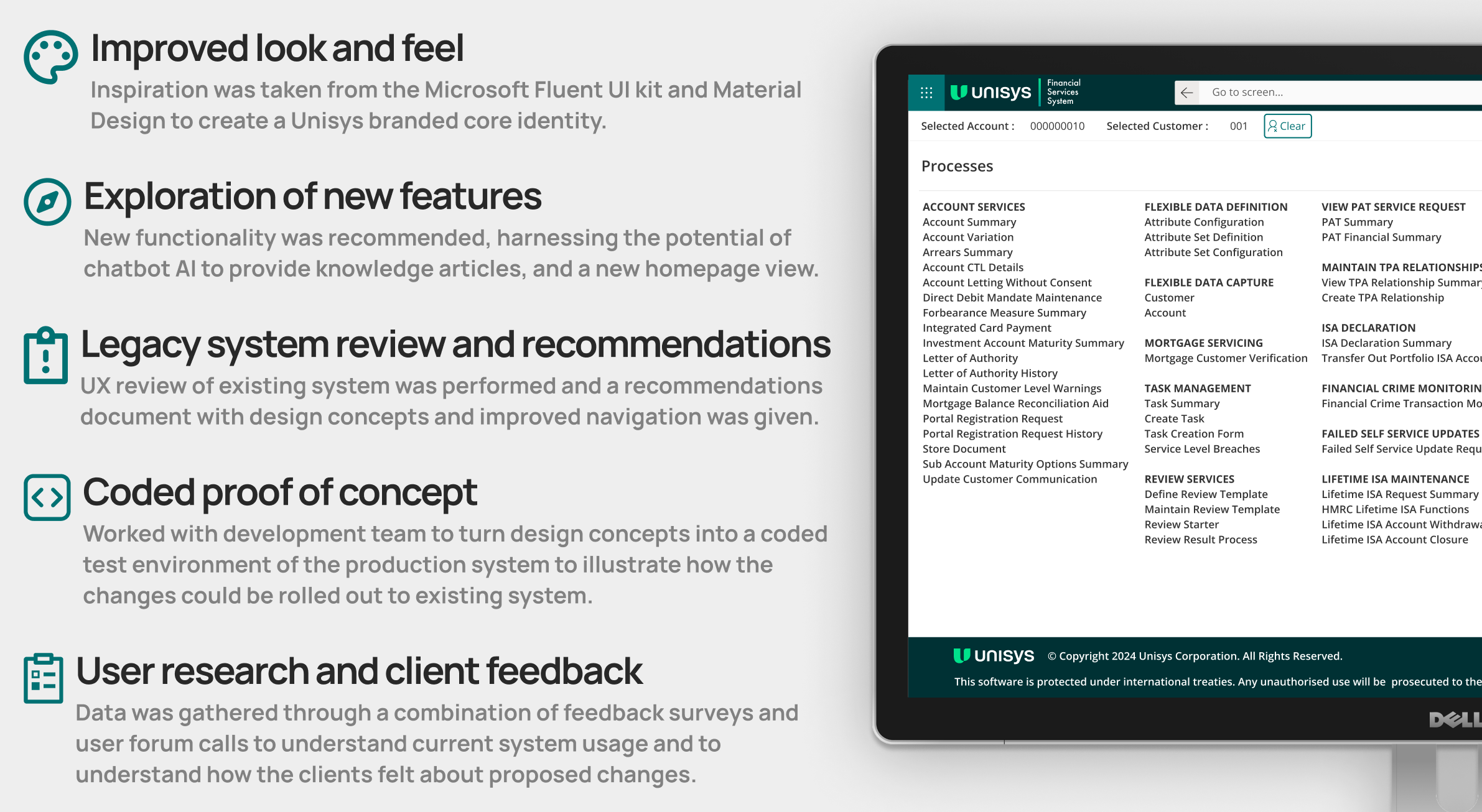
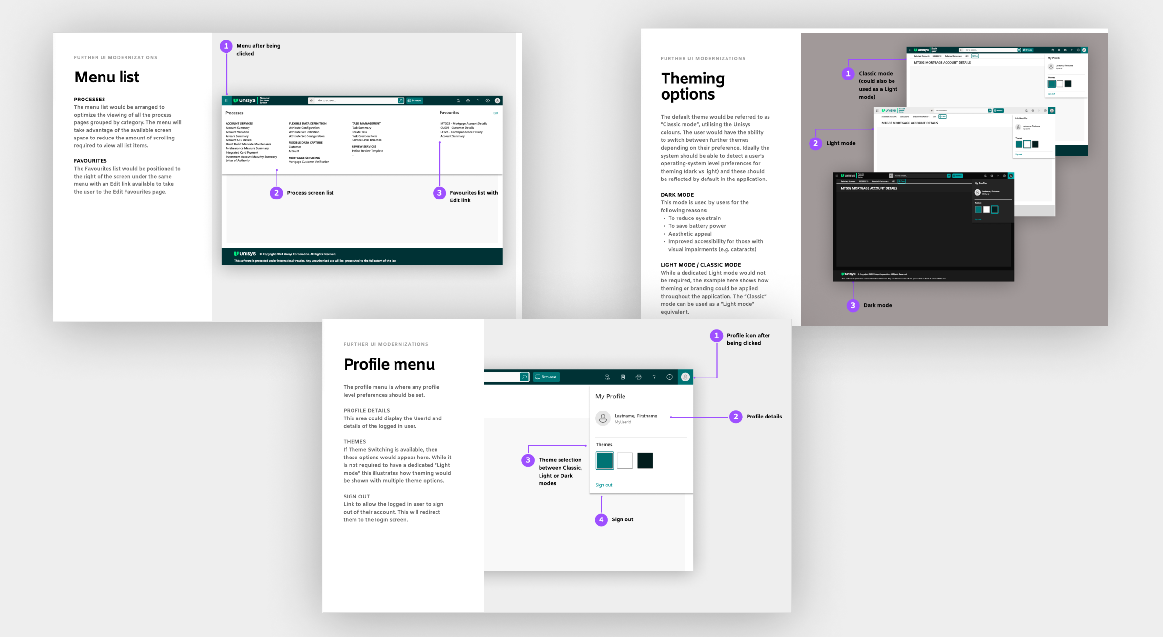
Menu
A new layout was proposed for the menu to enhance how many items were visible at once and to increase scannability. An edit link was also proposed as a shortcut into the page where favourites are set, as previously this feature was unknown to a selection of users.
Theming Options
A variety of themes was proposed to illustrate how different visual identities could be potentially applied to the new design concept. Dark mode was an option already explored by the development team but it had not been implemented correctly, so a new proposed dark theme was shown.
Profile Menu
A profile menu was introduced, and designed so that it could be extended with additional features as required. As an initial MVP it would display the logged in user’s name, user ID, a Sign Out link, and this would be the location to change the currently applied visual theme.
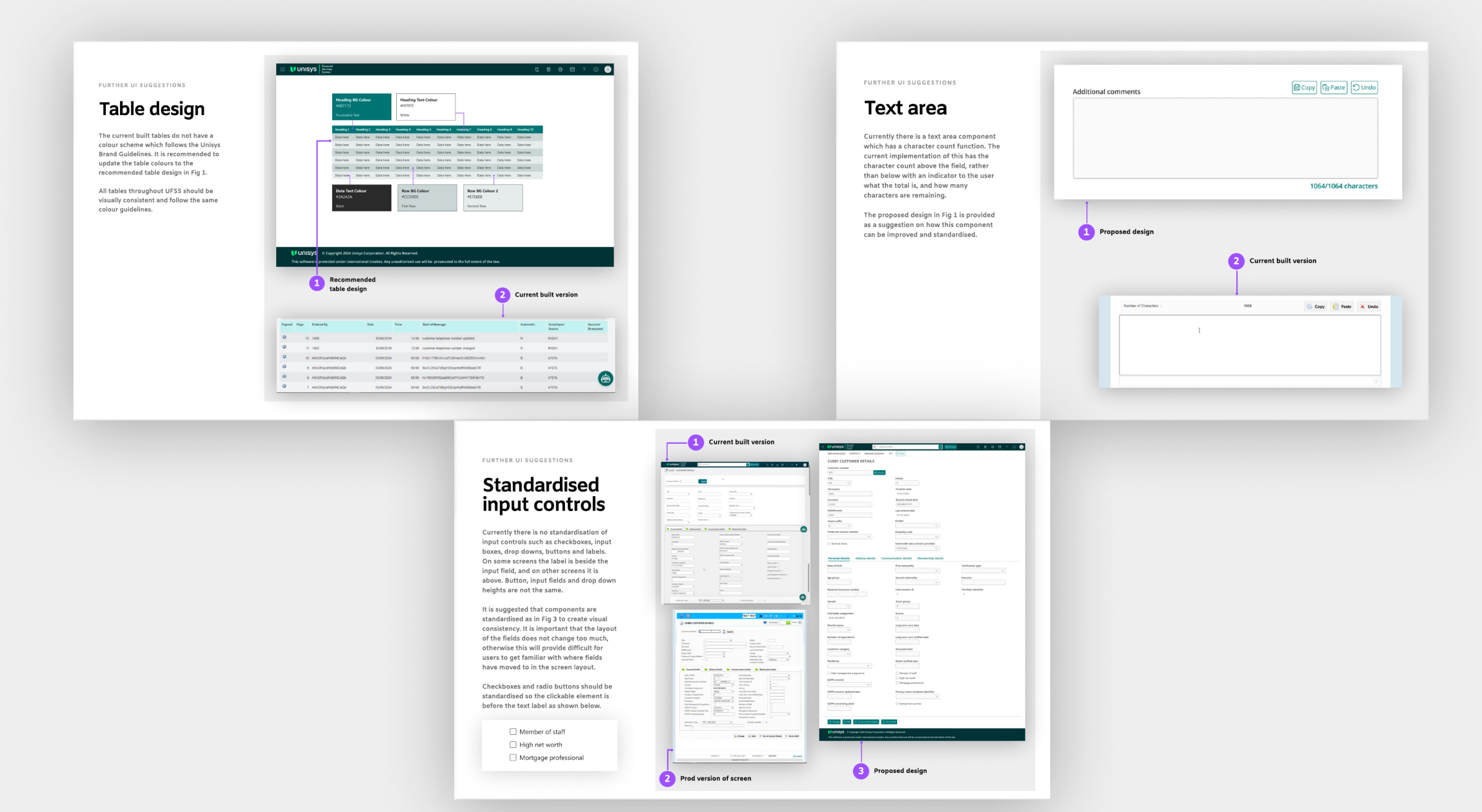
Style guides for table design and standardising components
Guidance was provided on colour themes for tables and components and their different states were created in Figma for the development team to reference.
Deliver
Reviewing the developed version and performing design iterations
Design review on test environment build
A design review was performed on the test environment PoC after it had been updated with the recommended design changes. Further feedback was given on some of the implemented features where they did not align completely with the design concepts.
Login Screen
Some of the implemented colours were not correct, so guidance was given on what these colours should be, along with guidance on how to use the style guide.
Loading Animation
A loading animation had been implemented but it was not accessible. Guidance was provided to increase the contrast of this element.
Home Screen & Profile Menu
Some visual discrepancies between the Home Screen design and the Profile menu design and the implementation were discussed.
Menu & Global Heading
Some alignment issues were noticed in the developed version compared to designs.
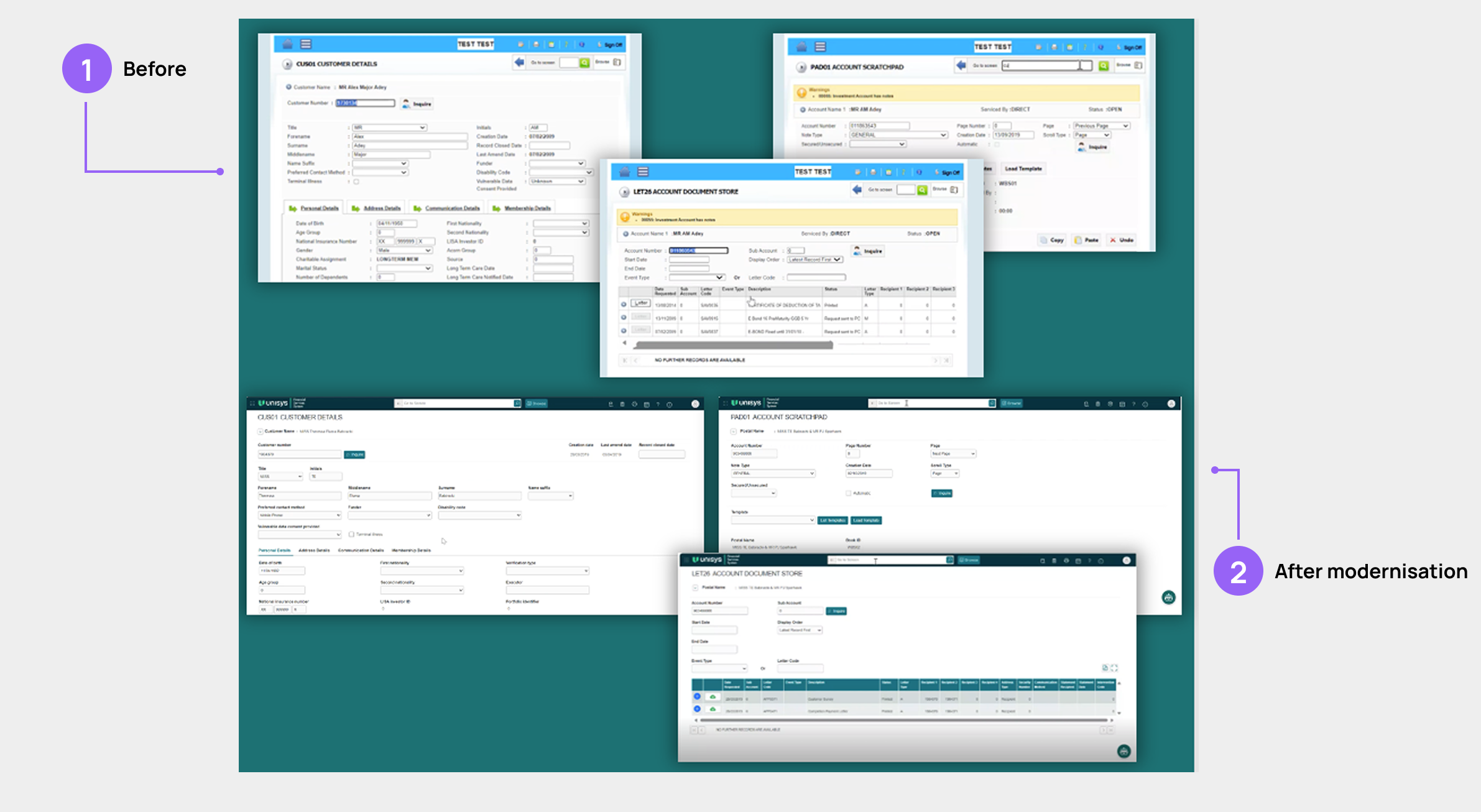
Before and after comparison
This is a selection of some of the screens which were in scope for the modernisation project, with the original legacy screens above and the updated UI versions below. These are screen grabs of the developed versions which were shown to the client from the test environment and were the basis of the feedback survey and positive engagement.
Banking Client Feedback Survey
Another Microsoft Forms feedback survey was created to understand how our clients felt about the proposed changes to the system. The overall feedback was positive, with some clients commenting on how they liked the idea of dark mode especially as that would help users who struggle with headaches. Some clients wanted to understand the technical aspects of how the updated screens would be rolled out and how this would impact automation.
Project challenges
The scope for this project was very limited, as for the initial PoC the technical team wanted to avoid any design changes that impacted the direct layout and data on the system. Only presentation changes could be made, and no impact to journey flows was possible at this point.
The current system was built on vanilla CSS and HTML with no front end development libraries currently being used. This meant that a lot of the changes that needed to be made to the system had to be implemented through stylesheets and there were technical challenges with limiting the scope of the changes to the piloted screens.